
Here to solve your challenges.
We have a lot of new News to share with you, and it’s fair to say that the last few months have been rather busy! We kicked off with a merger of businesses, two new UK locations, and, to top it all off, we launched a shiny new look and feel.
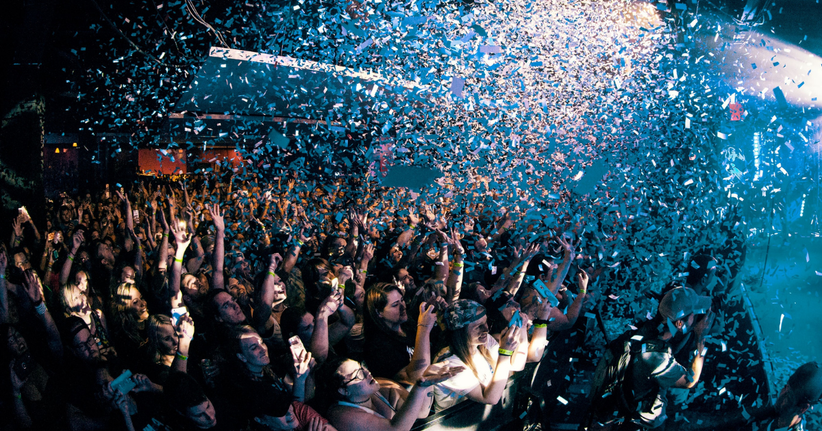
Sixteen years ago, In2Events began delivering high-end events for the technology sector and became one of the UK’s top 50 event agencies. However, for CEO Gavin Farley, bigger and better were always on the horizon, “it felt like there was something more we could be offering, so, during the pandemic, we took the opportunity to start building the extraordinary and turned potential ruin into success”.
Individually amazing, but together unstoppable.
We are excited to announce asembl. to the events industry. By joining the force of In2Events and other legacy brands, we can provide our clients with even more services, talent and value. As the saying goes, “there is power in numbers”, which is our very essence because individually, each brand was amazing, but together we are now unstoppable. Farley says, “asembl. has changed everything. Our clients will be able to find everything they need under one roof. Basically, you tell us what you need, and we will reimagine it and deliver it.”
asembl. is here to lead the conversation for the world’s best brands by helping them communicate in a creative, impactful, and simple way. With the merger of specialists from across the events industry, we can offer our clients a wider selection of services. From conceptualisation and design through to completion, asembl. has it covered. Find out more about our services here.
Simplicity at the core.
“When we thought about what the industry is missing, the answer was simplicity,” says Farley, “so when we laid the foundations of asembl., we wanted simplicity at the core”. This simplicity has been captured in our colour palette of black and white with explosions of colour. It’s all laid out clearly and easy to understand, symbolising our transparent, jargon-free approach.


.png?width=1024&height=640&name=The%20power%20of%20Events%20Supporter%20(1).png)